

FluentUI.Blazor v5 RC3
Announcing Fluent UI Blazor v5 RC3 — ColorPicker, Wizard, Global Overlay, and More
We are excited to announce the third Release Candidate of Fluent UI Blazor library v5! Since RC2, the team continued to deliver on the dev-v5 branch with two new components — FluentColorPicker and FluentWizard — a brand new global Overlay service, programmatic control of FluentMenu, plus a long list of refinements to Dialog, Badge, Checkbox, Switch, Input, and DataGrid components. RC3 also includes important fixes for Safari/iOS and SSR forms, and a major overhaul of the [Parameter] XML documentation across the whole library — improving both IntelliSense and MCP-powered AI tooling.
Visit our Demo web site.
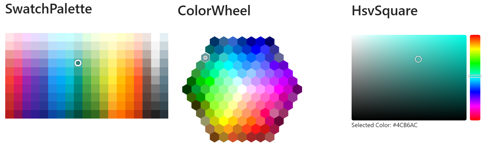
New Component: FluentColorPicker
The FluentColorPicker lets users pick a color from a predefined palette or an interactive color surface. It supports three different views, exposed through the ColorPickerView enumeration:
- SwatchPalette — a grid of predefined color swatches.
- ColorWheel — a hexagonal color wheel showing a curated set of colors.
- HsvSquare — an HSV square that allows picking any color by hue, saturation and value.
The selected color is always returned as a hex string (for example #FF0000) that you can bind to your own model with @bind-Value or @bind-SelectedColor.
Basic usage
<FluentColorPicker @bind-SelectedColor="@MyColor"
                   View="ColorPickerView.HsvSquare" />

@code
{
    string MyColor { get; set; } = "#0078D4";
}
FluentColorPickerInput
The FluentColorPickerInput component combines a text input with a popover FluentColorPicker, providing a compact, form-friendly color selector that fits naturally next to other input controls. You can choose which View is displayed in the popover and optionally hide the text input with HideTextInput to keep only the swatch button.
<FluentColorPickerInput @bind-Value="@MyColor"
                        View="ColorPickerView.SwatchPalette" />
Both components are unstyled wrappers around the same picking logic. See #4712 for details.
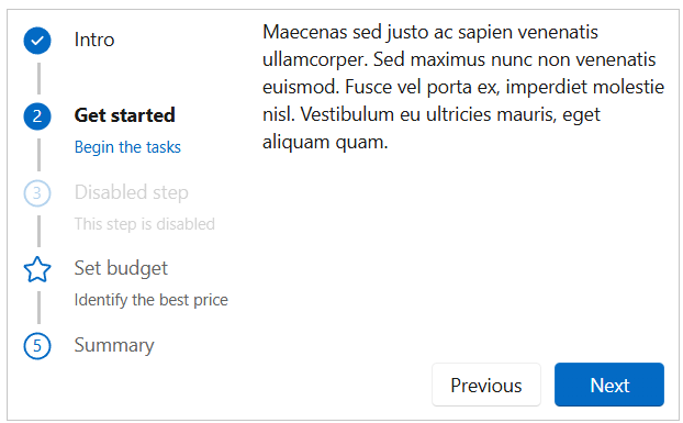
New Component: FluentWizard
The long-awaited FluentWizard component is now available in v5, migrated from v4 with improvements and a fresh API. It guides users through a sequence of steps, with built-in support for validation, step templates, custom buttons, and horizontal or vertical layouts.
Basic usage
<FluentWizard @bind-Value="@StepIndex" OnFinish="@OnFinishAsync">
    <Steps>
        <FluentWizardStep Label="Account">
            <p>Enter your account information.</p>
        </FluentWizardStep>
        <FluentWizardStep Label="Profile">
            <p>Tell us about yourself.</p>
        </FluentWizardStep>
        <FluentWizardStep Label="Confirm">
            <p>Review and submit.</p>
        </FluentWizardStep>
    </Steps>
</FluentWizard>

@code
{
    int StepIndex { get; set; } = 0;

    Task OnFinishAsync() => Task.CompletedTask;
}
Highlights
FluentWizardStepValidator— Attach validation logic to a step to prevent the user from navigating forward until the step is valid.- Custom
ButtonTemplateandStepTemplate— Fully customize the appearance of the navigation buttons and step header. - Horizontal & vertical layouts — Pick the orientation that fits your design.
- Step status — Each step exposes a
WizardStepStatus(None,Current,Done,All) for advanced rendering scenarios.
See #4682 for the full migration details.
Global Overlay via IDialogService
In addition to the existing FluentOverlay component, you can now use the IDialogService to display a global overlay from anywhere in your application without having to declare a FluentOverlay in your markup.
Only one global overlay can be displayed at a time. The overlay shows a centered spinner with an optional text message displayed below it. You can also choose a CardAppearance to customize how the overlay content is rendered.
Show and hide
@inject IDialogService DialogService

// Simple overlay
await DialogService.ShowOverlayAsync();

// With a custom message and spinner size
await DialogService.ShowOverlayAsync(options =>
{
    options.Text = "Processing...";
});

// Hide it
await DialogService.HideOverlayAsync();
FluentMenu — Programmatic Open & Target Positioning
FluentMenu can now be opened and closed programmatically, and positioned relative to any element in the DOM. This is ideal for context-menu scenarios where the menu should appear next to the element the user right-clicked.
The new OpenMenuAsync method accepts an optional targetId parameter. When supplied, the menu is positioned relative to the element with that id instead of the original Trigger element. You can fine-tune the position with the targetOffsetLeft and targetOffsetTop parameters (in pixels).
<div id="Target1" @oncontextmenu="@(e => Menu.OpenMenuAsync("Target1"))">Zone 1</div>
<div id="Target2" @oncontextmenu="@(e => Menu.OpenMenuAsync("Target2", targetOffsetLeft: 10, targetOffsetTop: 5))">Zone 2</div>

<FluentMenu @ref="@Menu">
    <FluentMenuList>
        <FluentMenuItem>Menu item 1</FluentMenuItem>
        <FluentMenuItem>Menu item 2</FluentMenuItem>
        <FluentMenuItem>Menu item 3</FluentMenuItem>
    </FluentMenuList>
</FluentMenu>

@code
{
    FluentMenu Menu = default!;
}
See #4860.
Dialog Enhancements
The FluentDialog component received several improvements in RC3:
| Feature / Fix | PR |
|---|---|
| Customizable header actions (add buttons or content) | #4851 |
PreventDismissOnEscape parameter |
#4843 |
| Alignment options for dialog placement | #4849 |
| Better dialog height for mobile devices | #4853 |
| Fix dialog instance tracking to prevent unnecessary re-renders | #4755 |
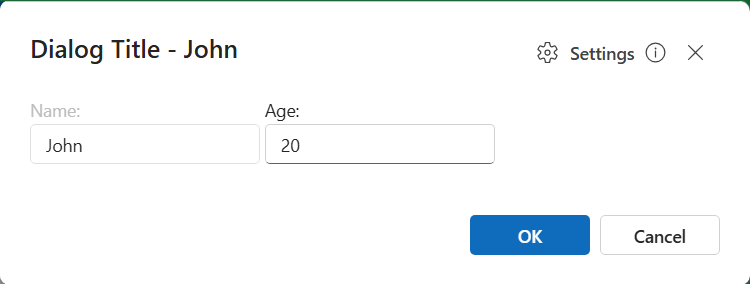
Component Refactors — ChildContent everywhere
Several components have been refactored to use the standard ChildContent parameter, making them more consistent with the rest of the library and easier to compose:
FluentBadge— now usesChildContentand a newAnchorContentparameter (#4845)FluentCheckboxandFluentSwitch— labels are now provided throughChildContent(#4844)
<FluentCheckbox @bind-Value="@IsAccepted">
    I accept the <a href="/terms">terms and conditions</a>
</FluentCheckbox>

<FluentSwitch @bind-Value="@DarkMode">
    Enable dark mode
</FluentSwitch>
Input & Form Improvements
- Nullable parameter validation in
FluentInputcomponents (#4847) — All input components now correctly validate nullable bound values, fixing subtle binding issues withint?,DateTime?, etc. - Inherit font size and family (#4856) — Inputs now inherit the typography of their container by default.
FluentAutocomplete— fixOnSetValueinitial value (#4757) — The initial value is now correctly applied on first render.
Lists & DataGrid
SelectedItemsExpression/SelectedItemExpressionon lists (#4759) — Provide a strongly-typed expression for the selected item(s), enabling validation and form-aware binding similar toValueExpressionon inputs.OnChangeAfterintegration test (#4753) — Verifies that the after-change event fires correctly for all input types.
Card
CardShadow.None(#4758) — A new value to render a flat card without any shadow.
<FluentCard Shadow="CardShadow.None">
    Flat card content
</FluentCard>
Theme Fixes
- Fix
data-themeforlightandsystemvalues (#4766) — Resolves cases where the light or system value was not applied correctly when reading thedata-themeattribute on<body>.
Navigation
FluentNav— accessibility & comment cleanup (#4868) — Clarified theWidthparameter behavior, removing the misleading “default” mention from the documentation comment.
Documentation & Tooling
The documentation site received a major polish pass:
| Improvement | PR |
|---|---|
| Search & filter for localization strings | #4836 |
| API docs & updated localization section | #4841 |
DocViewer — Enhanced support for multiple JSON comment files |
#4774 |
Migration guide for @OnClick event handlers |
#4748 |
| Updated migration guide | #4855 |
Clarify documentation for Header and HeaderTemplate parameters in FluentTab |
#4765 |
Add link to FluentLink in the docs |
#4840 |
| Note about daily updates and link to setup instructions | #4749 |
Enhanced code styling in MarkdownViewer (font-family and overflow-wrap) |
#4832 |
Use AssemblyLoadContext to read correct DLL versions in the demo |
#4829 |
| New SSR debug project to investigate server-side rendering scenarios | #4831 |
MCP Server
ListCategoriesandListEnumsMCP tools (#4764) — The MCP server now exposes tools to list all categories and enums available in the library, making it easier for AI agents to discover and reason about the API surface.
Mobile, Safari & SSR Fixes
RC3 ships a batch of platform fixes focused on mobile browsers and server-side rendering scenarios:
FluentToast— sizing fix for Safari on macOS and iOS (#4871).FluentPopover— consider the visual viewport on mobile devices (#4872).FluentSwitchandFluentCheckbox— work in SSR forms (#4875).
IntelliSense & MCP — Parameter XML Docs Overhaul
A large series of PRs (part of #4777) reviews and rewrites the XML <summary> documentation on [Parameter] properties across the entire library. The goal is twofold: provide cleaner IntelliSense in your IDE, and feed the MCP server with accurate descriptions that AI agents can rely on to generate correct code.
Across these PRs, typical fixes include copy/paste mistakes, swapped descriptions, missing “Gets or sets” prefixes, broken cref references, double-negatives, and grammar/typo cleanup — plus added cross-references between related parameters.
If you build tooling on top of the MCP server, or simply rely on IntelliSense to discover parameters, this is a significant quality-of-life improvement.
Visit this page https://v5.fluentui-blazor.net/Mcp to use our Fluent UI Blazor MCP Server.
Try It Now
| Resource | Link |
|---|---|
| NuGet | Microsoft.FluentUI.AspNetCore.Components --prerelease |
| Documentation | https://v5.fluentui-blazor.net |
| GitHub | https://github.com/microsoft/fluentui-blazor |
| Migration Guide | Migration to v5 |
This third Release Candidate brings us very close to the final v5 release. The API surface is now considered stable, and we’re focusing on polish, fixes, and the remaining items tracked in dev-v5 - TODO List.
As always, please file issues on GitHub and don’t hesitate to contribute. A huge thank you to everyone who tested RC2, reported issues, and submitted pull requests — special thanks to community contributors like @MarvinKlein1508, @aclerbois and @vnbaaij for their continued involvement.
Happy Blazoring!