Overview
We’ve just released a new version 4.7.2 of Microsoft.FluentUI.AspNetCore.Components. This version fixes some bugs detected over the last few days, but also adds a few new features.
- DataGrid: new
ShowHoverparameter and Multi-selection of rows. - InputLabel: new
Orientationparameter to position the label in front of or above the component.
DataGrid
-
Integration of the
ShowHoverparameter to automatically underline the hovered line. -
Implement the MultiSelect option by adding an additional column named
SelectColumn.
There are two ways of managing a SelectColumn.
-
Either by supplying a list of data via
Itemsand letting the DataGrid manages the selected rows entirely, via theSelectedItemsproperty.<FluentDataGrid Items="@People" ShowHover="true" TGridItem="Person"> <!-- THIS LINE TO HAVE MULTISELECT --> <SelectColumn TGridItem="Person" SelectMode="@DataGridSelectMode.Multiple" @bind-SelectedItems="@SelectedItems" /> <PropertyColumn Width="100px" Property="@(p => p.PersonId)" Title="ID" /> <PropertyColumn Width="300px" Property="@(p => p.Name)" /> <PropertyColumn Width="150px" Property="@(p => p.BirthDate)" Format="yyyy-MM-dd" Sortable="true" /> </FluentDataGrid> -
Or by manually managing how selected lines are saved, via
Property,OnSelectandSelectAll. This requires more configuration but is probably more interesting when usingVirtualizeor when directly managing a customIsSelectedproperty.Property: Function to be executed to display the checked/unchecked icon, depending on your data model.OnSelect: Action to be performed when the line is selected or deselected.SelectAll: Value indicating whether the [All] checkbox is selected.
  <FluentDataGrid Items="@People" ShowHover="true" TGridItem="Person">
      <!-- THIS LINE TO HAVE MULTISELECT -->
      <SelectColumn TGridItem="Person"
                      SelectMode="@DataGridSelectMode.Multiple"
                      Property="@(e => e.Selected)"
                      OnSelect="@(e => e.Item.Selected = e.Selected)"
                      SelectAll="@(People.All(p => p.Selected))"
                      SelectAllChanged="@(all => People.ToList().ForEach(p => p.Selected = (all == true)))" />

      <PropertyColumn Width="100px" Property="@(p => p.PersonId)" Title="ID" />
      <PropertyColumn Width="300px" Property="@(p => p.Name)" />
      <PropertyColumn Width="150px" Property="@(p => p.BirthDate)" Format="yyyy-MM-dd" Sortable="true" />
  </FluentDataGrid>
These examples use a class containing :
DataGridSelectMode Mode = DataGridSelectMode.Multiple;
IEnumerable<Person> SelectedItems = People.Where(p => p.Selected);

record Person(int PersonId, string Name, DateOnly BirthDate)
{
    public bool Selected { get; set; }
};

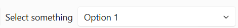
InputLabel: Orientation
As indicated in Fluent Design, a label must be placed above the input component to which it belongs. It also says: “Optionally, you can left-align labels if space is limited and fields are of a consistent type and width. Be careful when aligning labels on the left, as this can impair legibility.”
This option can of course be used in a toolbar, for example. To make it easier to place the label in front of the input rather than above it, an Orientation parameter is added to the component.
By setting its value to Orientation.Horizontal (the default is Orientation.Vertical), the label is aligned in front of the component.
<FluentInputLabel ForId="s1" Orientation="Orientation.Horizontal">Select something</FluentInputLabel>
<FluentSelect Id="s1" Class="below outline" @bind-Value="@comboboxValue" TOption="string">
    <FluentOption id="option-15">Option 1</FluentOption>
    <FluentOption id="option-16">Second option</FluentOption>
    <FluentOption id="option-17">Option 3</FluentOption>
</FluentSelect>
Miscellaneous corrections
The rest of the fixes and changes for this release are (again) quite a long list. We refer you to the What’s new page on the documentation site for a complete overview (including links to issues and change requests on GitHub).
Web sites
- Documentation: https://www.fluentui-blazor.net
- Preview: https://preview.fluentui-blazor.net
- NuGet packages .NET8: https://aka.ms/blazor/fluentui/libs
Feedback
If you find something out of the ordinary, let us know in the repo on GitHub, or Twitter / X.