FluentUI.Blazor v4.2
Overview
We’ve just released a new version 4.2 of Microsoft.FluentUI.AspNetCore.Components. This version fixes some bugs detected over the last few days, but also adds a few new features.
- FluentDesignTheme: manage your website theme and colors
- FluentCheckbox: Intermediate mode added
- FluentAutoComplete:
AutoCompleteattribute to disable (Off) the browser’s default autocomplete. - FluentGrid: HiddenWhen attribute to hide elements when the screen is resized.
- FluentInputFile:
ProgressTemplateand bindableProgressPercent.
New features
FluentDesignTheme
The Theme Provider specifies all the colors, sizes and shadows for your layout.
FluentDesignTheme lets you quickly manage the main color and mode (dark/light) of your entire application. If you wish to customize all or part of the details of your application, please use DesignTokens.
Quick guide
-
First, choose a name to save the theme mode (dark/light) and color, in the browser’s local storage. for example:
theme. -
Then add this line to your
App.razorfile (or to your Layout page), to automatically apply the theme to all your pages.<FluentDesignTheme StorageName="theme" />" -
To avoid a “flashing effect” when the page loads (mainly in dark mode), we recommend you add these lines of code to the
index.html,_layout.cshtmlorApp.razor(.NET8) file.<!-- Set the default theme --> <script src="_content/Microsoft.FluentUI.AspNetCore.Components/js/loading-theme.js" type="text/javascript"></script> <loading-theme storage-name="theme"></loading-theme> <!-- End -->" -
Finally, you can add a button or page that allows the user to choose their theme. To do this, you need to use a
FluentDesignThemecomponent to which you can bind theModeandOfficeColorproperties, and define aStorageNameto store all this in the LocalStorage.@implements IDialogContentComponent <FluentDesignTheme @bind-Mode="@Mode" @bind-OfficeColor="@Color" StorageName="theme" /> <FluentSelect Label="Theme" Items="@(Enum.GetValues<DesignThemeModes>())" @bind-SelectedOption="@Mode" /> <FluentSelect Label="Color" Items="@(new OfficeColor?[] { OfficeColor.Word, OfficeColor.Excel, OfficeColor.PowerPoint })" @bind-SelectedOption="@Color" /> @code { private DesignThemeModes Mode = DesignThemeModes.System; private OfficeColor? Color = OfficeColor.Word; }
ℹ️
FluentDesignThemeis also available as a Web Componentfluent-design-themefor easier management of the theme from within JavaScript code.
You’ll find a complete example in the video, which explains step by step how to add a theme management page.
FluentCheckbox
Added choice of order between Uncheck / Intermediate / Check via the ThreeStateOrderUncheckToIntermediate attribute.
#1099.

NavMenu
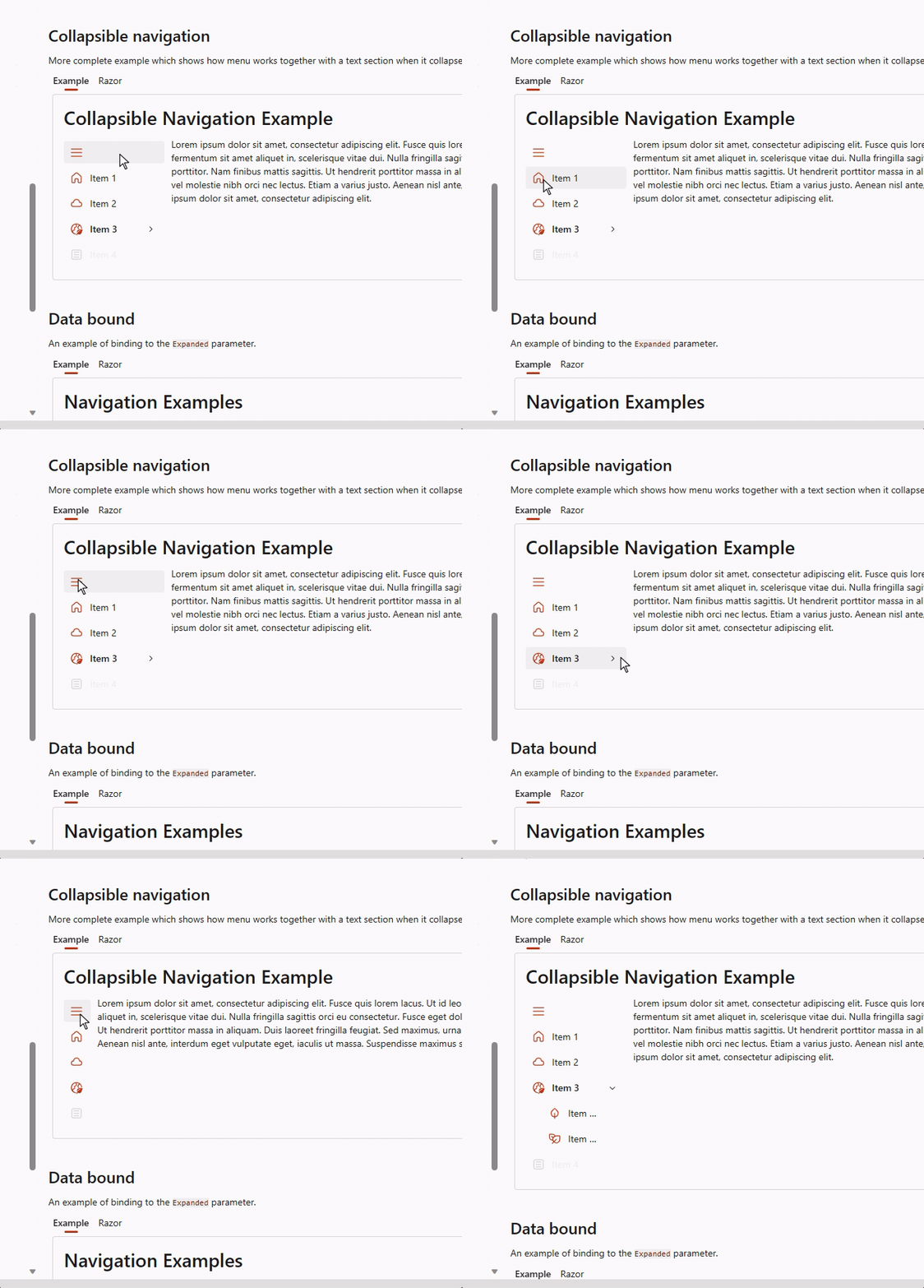
The NavMenu components have been enhanced to make it possible for the menu to expand when it is in its collapsed state and navigation item’s icon is clicked.
The NavMenu components now support tooltips for both groups and items. Groups already had the Title parameter being used for this, this can now be overriden with the Tooltip parameter

FluentAutoComplete
Add an AutoComplete attribute to disable (Off) the browser’s default autocomplete. 1084.
FluentGrid
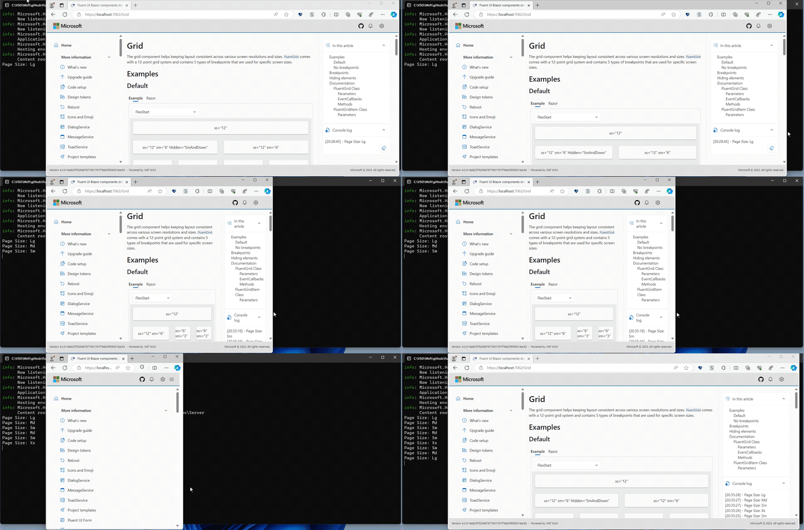
Added HiddenWhen attribute to hide elements when screen is resized 1048.

FluentInputFile
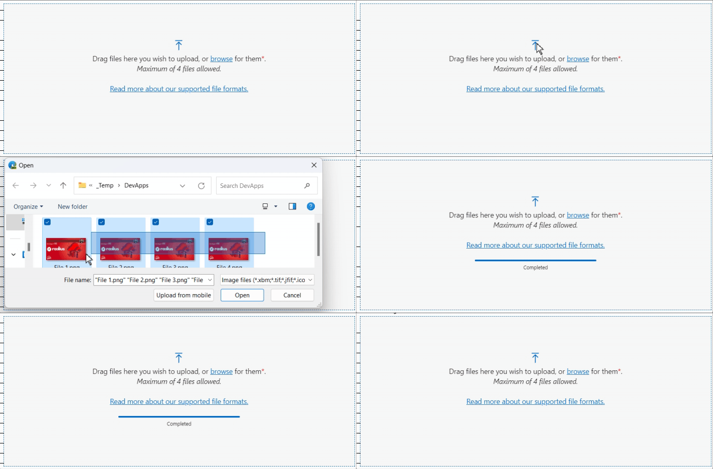
Added ProgressTemplate template and ProgressPercent bindable attribute 1037

List components
With the new OptionTemplate parameter, you can supply custom content for each option in the list components (listbox, select, combobox and autocomplete).
As already mentioned, we use this internally to give a visual representation of the accent color in the DesignTheme component.
Another example is available on the documentation pages for the different list components.
Templates
A lot of fixes have been implemented to make sure pages and layouts get the right @rendermode attribute set and NavMenu options based interactivity choices made during the creation of an application.
Install the Visual Studio Template using this link.
Preview NuGet Feed
If you want to be on the bleeding edge and follow along with what we are building next, we have a feed available that hosts the packages for the core library which are built on each commit we do to the dev branch. The address of the feed is https://pkgs.dev.azure.com/fluent-blazor/public/_packaging/previews/nuget/v3/index.json
This is not a flow for use in Production. This flow is directly linked to our Development branch. It is therefore possible (probable) that some Packages may cause problems for a few hours, to detect and correct them.
Web sites
- Documentation: https://www.fluentui-blazor.net
- NuGet packages: https://aka.ms/fluent-blazor-libs
Feedback
If you find something out of the ordinary, let us know in the repo on GitHub, or Twitter / X.

